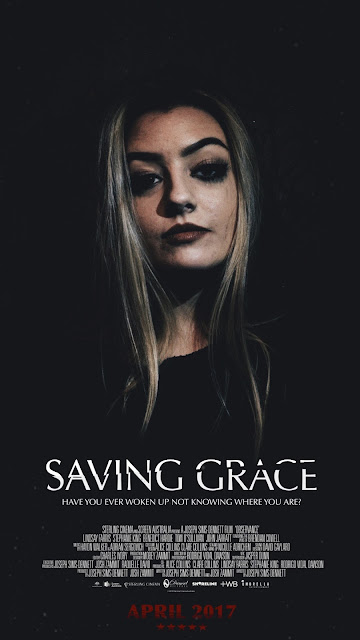
Poster Ideas - How I Made the Final Poster Design.
I wanted liked the blue concept of this poster however i feel like the design should be more minimalistic and fit and black, white and red colour scheme as i believe it would have been more fitting to our film. I also liked the layout of the poster and how it had the title, credits then the date all centralised.
This is the poster to feature the minimal colour scheme of black white and red. I thought the text was good however i didn't particularly like how it was red and not white. I also wanted the text to look more like a logo rather than just a title to almost create a brand for the film we were creating in order to make it seem more recognisable, if we were to have a larger audience.
I finally decided on this poster as it features all of my decided colour palette with a slight tint of blue which makes the writing pop and catch the eye of the viewer. The logo stands out more as it features a design rather than just a simple title, giving it more of a professional look to it. I also added a fade over the image as it adds to the mystery of what will happen to Grace through out the film as well as stars to imply it is night time, which is when the majority of the film is set.


No comments:
Post a Comment