
The Shawshank Redemption.


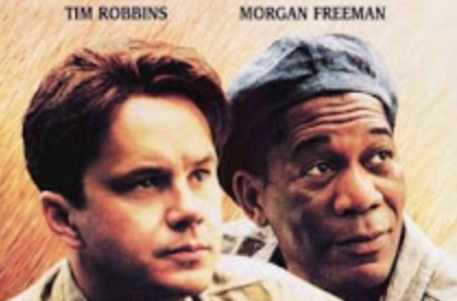
Within the poster below from the popular film 'The Shawshank Redemption' immediately we are greeted by the faces of the two protagonists. This is done to allow the audience to know that Tim Robbins and Morgan Freeman have a lot of screen time within the narrative; if the demographic happen to be fans of one of these actors it will attract a larger audience. Along this is another picture below, however making out who the character is, is a mystery. This will have been done in order to hint at plots in the film, and allow demographics to have a wider understanding.

The lighting within a thriller poster is meant to create a mysterious and tense atmosphere for the viewer, these posters tend to use low key lighting as it can be related to shadows. Shadows are known from audiences as the unknown, using this on a poster pushes the demographic to find out who/what could be hiding. This is used below the two main protagonists as the mysterious man is shown. Because we can not see his face, and his body is in low key lighting, this excites audiences as they are then pushed to find out who the figure is.
Within a thriller poster, the colour schemes always tend to use either a mixture of warm colours (Red, yellow and orange), a mixture of cold colours (shades of blue) or black and white. Within this film poster, it is clear that they mixed warm shades of orange together, in a pattern which appears to resemble falling rain. This mixture of image and colour may have a certain importance within the film, therefore making it the perfect reason to use on the poster.
The title of this film appears central on the poster in order to show it's importance. Despite the poster using warm colours such as orange and yellow as a colour scheme, when the title was written, it was done so in a shade of white. The colour white shows innocence and purity, therefore the designers of this poster may have included this because innocence is a theme throughout. The letters are each in capitals in order for audiences to be able to read the text clearly and allow it to 'jump out' at them. This could have also been considered when choosing the colour was white, as it again jumps straight out to the audience due to it being different.

A review is used on a poster as it indicates discretely to the demographic if the film is good and worth watching. Due to not giving away the full story, audiences then feel like they want to find out what happens and go to watch the film. The "Two Thumbs up" from Siskel and Ebert is a USP because it is giving the film a stamp of 'approval' from highly respected and prestigious film critics. This helps to make audiences aware that the film is a success.


If a Director or Producer is well known to audiences, they will more than likely be included on the poster. This also is the same with Actors as audiences usually follow popular film stars and then watch following films that they appear in. These actors names are usually seen at the top or bottom of film posters as they are significant and need to be seen by audiences. Within this particular poster, the two lead characters actors are seen at the very top of the page, in a sense 'bigging' them up for their outstanding performance.

My Analysis of the second Shawshank Redemption poster:

No comments:
Post a Comment